
A helpful resource
The Climate Reanalyzer is a great visualization tool for anyone who wants to explore current data in real time.

First of all, thank you to everyone who has given me feedback about my IPCC series. I am so glad that you are enjoying learning about the many problems facing oceans! My goal is to make oceanography accessible, and I aim to explain, analogize, and break down everything so that everyone can understand contemporary science. Yet I realize that for non-sciencey people, parts of my explanations can get too technical. Some are kinetic learners who prefer to explore information on their own time and terms. Others may be visual learners who enjoy watching brightly-colored animations instead of reading a newsletter. Thankfully, there’s an app interactive website for that!
The Climate Reanalyzer is a collection of helpful maps that illustrate the current conditions of our planet. The website is run by the University of Maine and is very user-friendly. The most basic map shows today’s weather & conditions. You can look at the world from a vertical perspective (looks like half of a globe), or scroll down to see a Mercator projection (giant flat rectangle). If you click on the globe, the view cycles through North America, Africa & Europe, Asia, the Pacific, South America, Antarctica, and the Arctic. My only criticism is that the map is very land-biased, i.e. there are few settings that let you observe the Atlantic or Indian Oceans as a whole.


There are a variety of variables that you can look at, from temperatures and pressure to cloud, snow, and sea ice coverage. But the most interesting things for we ocean-lovers are the sea surface temperatures and sea surface temperature anomalies. Sea surface temperatures (SSTs) are, quite obviously, the average temperature of our oceans at the surface. This data is collected by blending satellite, ship, and buoy measurements from NOAA (the National Oceanic & Atmospheric Administration). An anomaly is a data point that stands out from the average or norm. Temperature anomalies happen when an area of the planet is warmer or cooler than the historic average. For example, the Northern Hemisphere is currently in winter, but as I write this the sea surface temperatures are 0.4°C warmer than they should be! It is important to realize that this does not mean that the waters off North America and Europe did not experience winter. The northern Atlantic & Pacific Oceans have cooled, but not as much as they should have.
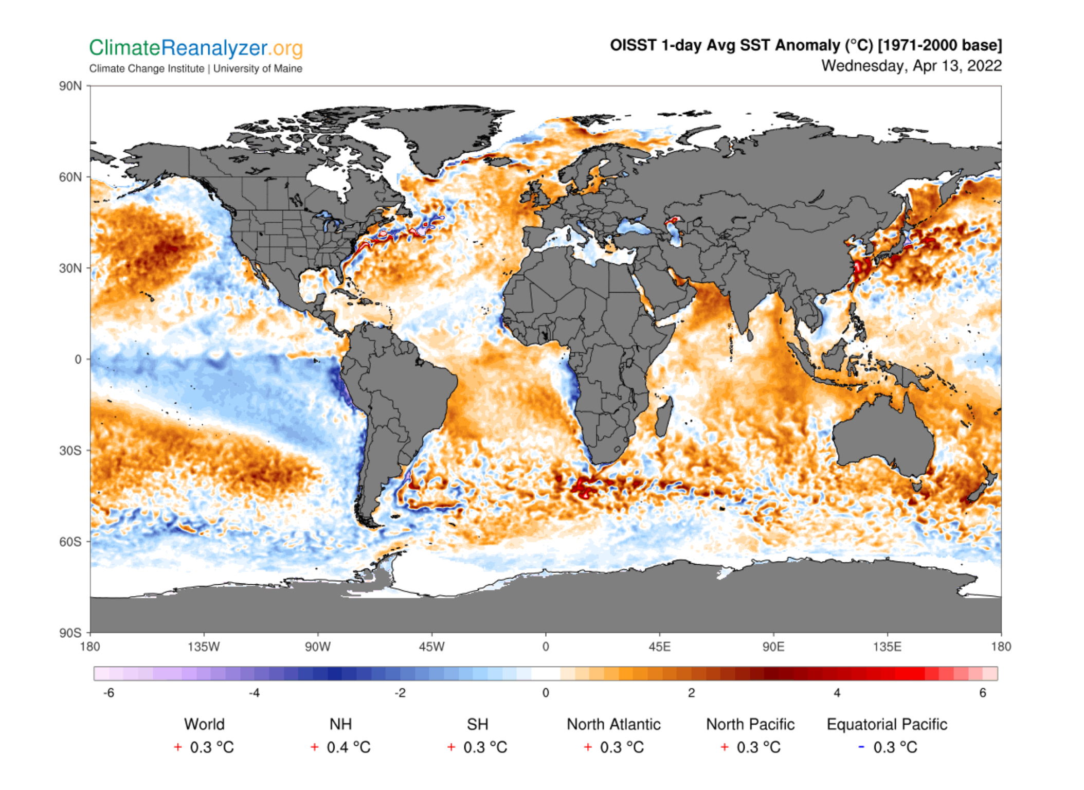
In the image above, you can see that the water off the US East Coast is warmer than normal, as are temperatures in the waters around Japan (you can see this illustrated in dark orange & bright red). Both the Gulf Stream and the Kuroshio Current flow from the equator up towards the North Pole — the former is in the Atlantic, and the later in the Pacific. If they are excessively warm, that means the Tropics are also excessively warm. This will lead to more severe storms, prolonged algal blooms, and potentially a decrease in the amount of deep water formed. In case you need a refresher on ocean circulation, and why any changes to it could be catastrophic, check out my post from 2 weeks ago:

The main goal of the Climate Reanalyzer is to contextualize contemporary data and compare it with that of the recent past. The reason I thought you would find this helpful is that it almost entirely relies on data from our current life times (aka the past half-century or so). The SST anomaly feature in particular allows you to see that our oceans have continued to warm since the public acknowledged global warming as an issue (since the 1980s, roughly). It’s also fascinating to compare the SST map with the SST anomaly map: this allows you to see the ocean’s current temperatures and how much they differ from the norm.


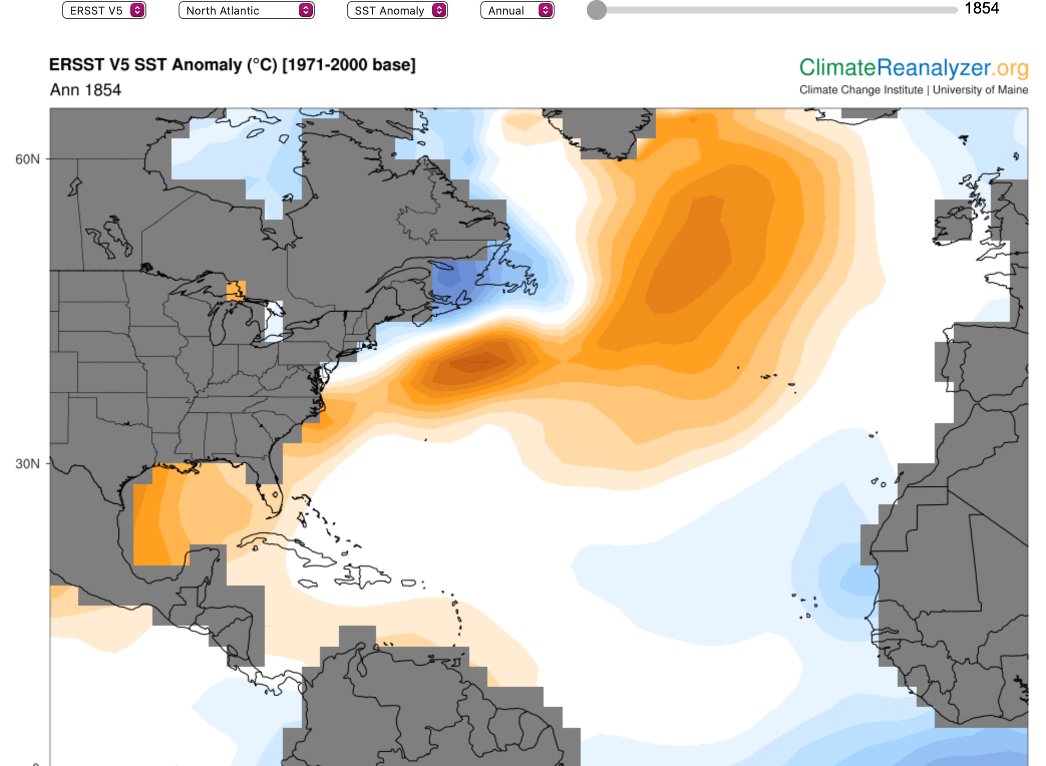
If you’re particularly enthusiastic, there are tabs on the upper lefthand side of the page that lead to more complex maps and models. Again, most of these are land-focused, but one in particular contains ocean data going back to the 1850s! The Monthly Global Sea Surface Temperature Time Series (quite a mouthful I know) shows SST and SST anomalies in predominantly US waters (Gulf of Maine, North Atlantic, etc.). If you move the slider from left to right, you can see the annual change in water temperatures. Even though some years were warmer or cooler than others, and the locations of the anomalies shifted slightly, it is obvious that the intensity of warming increased as the decades wore on:


One criticism of the Climate Reanalyzer is that it is biased towards the Atlantic Ocean and waters surrounding North America... then again, the site is run by a US university! All of the other map options are less user-friendly, and I would not recommend exploring them unless you have a particular interest in reanalysis, which is the process of calculating uncertainty. There are also options for daily & weekly weather forecasts (click “Weather”), an overview of the website, and an explanation of climate change.
All in all, the Climate Reanalyzer is a simple, straightforward introduction to interactive technology that scientists have created for the public. These tools are supposed to distribute the data out into the world, but they unfortunately do not get enough (or any) media coverage. Indeed, I did not find out about the Climate Reanalyzer until my college course on remote sensing and data collection! As mentioned above, this tool is very helpful for visual and kinetic learners — and it will serve as a great introduction to the IPCC’s interactive climate map, released in tandem with their 2022 Report. But I’ll save that for next week. Until then, enjoy all the Climate Reanalyzer has to offer!

All sources linked above.
P.S. please comment or reply to this email if you found the map to be useful — I may seek out more of them for future newsletters.